|
I have no idea what's going on here, but it sure looks exciting! :popcorn:
|
:| what's a "merkin"
(throwing down a bid for a logo depicting Moses and Abraham kissing) |
I love the logo!
and Green is a boy color? Love me some spyrograph! |
Are Merkins going to be in our Meet and Greet goodie bags again this year?
Is it going to be like last year and all the neebies have to wear them? |
Quote:
I never knew what a merkin was either until Medusa educated me back in the day. I have to say this looks like an "angry" merkin though. It has a mean merkin-like face. Actually the face patch looks like the "Chuckie" doll. And if that's the case, run for the hills and keep far, far away from this particular merkin. Got me thinking now. I wouldn't mind looking at a Wonder Woman Merkin...Now that'd be hot!! |
What really is a Merkin? It looks like a G-string, minus the strings. Is that what a Merkin is? Do they all look like shag carpets like this one?
I like the pink. |
weighin in brief style
The very reason I am on this site is bcuz it is a Butch Femme site. I never never never want any other way. Just last nite I found myself kinda worrying whether there would ever be enough members who joined and did not identify as bf...to change this site into a gay blend of people who are not into identification. Reading responses today makes me feel better. I do not appreciate an implication(imply not infer)(lol) that bf is a faze and that in a bettr reality we dont need to identify. It took me awhile to find a safe place to land. If you dont believe it can make a difference for life...attend a reunion...and come home. Come home and see all of us being us.
|
I like the fact that the f looks like a stilleto. But then, as far as I'm concerned, it's always about the shoes.
Words |
I'm too tired to think after a long hard work day
Wanted all y'all to know, I've enjoyed reading this thread Also, would like to see more bodies with Merkins please n ty The pink was hawt and I don't even like pink much |
Quote:
Quote:
|
I've loved reading everyone's thoughts as well, interesting stuff!
But for me? Pink and green are my favorite colors, have been since the preppy years. Have a pink sticker on my truck with bold black letters, never gave those letters much thought though because I just simply liked what it said, same here. I reckon if I picked hard enough in my tired brain, I could bemoan almost anything, lol :lips: |
I have waited to respond to this thread so I could collect my thoughts.....and my glasses :glasses:
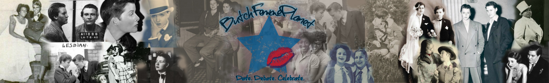
As an artist first who has designed logo's, I have to say I was very impressed by the aesthetic feel and the choice of font (trust me it's hard to come up with this stuff). Now as me, a butch..... I have found a home on these sites that are for butch, femme ideals so to speak. I am old,old,old school and when I came out very young this was how the world was, but it fit me to a tee. I know times and things have changed and yes, we are a dying breed. I have been to MANY other lesbian dating sites and forums and all I get from femmes is a "NO" cause they want other femmes or a mailbox full of butches wanting to date me. Now mind you none of this offends me, its just not my cup of tea. Here I have found a home where I know I can feel safe!!!!! Does this mean we are not accepting of all ideals and relationships? NO !!!! For once in my life I have found a place where my ideals and who I am are accepted!!! And we are accepting of everyone!!!! This is why I love BFP <3, I feel at home but we are a diverse group of individuals. Who cares if you pack or not, if you get nails or not, it doesn't matter!!!! What does matter is that we are accepting of all that want to share themselves with us, and accept us all for who we are as individuals!!! BFP rock on !!!!! And thank you for making this a home for everyone !!! |
random thoughts after a 15 hour day during which i missed all this...
...i love that this thread devolved into fuckery :D it seriously made my day to come home to. ...i love that picture of princessbelle and bulldog. ...i'm not a huge fan of binaries or stereotypes of what it means to be butch/femme. i don't think of butch/femme as a binary. i'm not a very girly femme. i rarely wear pink and i never wear heels. (okay, that's a lie, i wear them like once a year for work. but still.) the points that have been brought up here about the "butch is bold, femme is pink and flowery" ish is something that i've definitely thought of before with regards to the logo. and that's not really my deal, but it's cool. ...i love pink, green, and black together. green is my favorite color and i'm not a huge fan of pink but i love the hot pink/black combo. and the way it integrates with the whole color scheme of the site. ...the circles are really cool and i love the favicon. ...as a forum admin and a web designer i totally appreciate the amount of work it must have taken to make the logo (which is aesthetically gorgeous and AMAZING) and make the forum colors match. |
What I think is so cool about the Planet, is that a topic on a thread can start out in one direction, can take off into another, some folks can get riled up, others not so much and still others can make us think and feel.
In the end, for the most part, once the dust has settled, we can still come back together as a community. I really love that about this place. |
Quote:
|
I see randomness, graffiti, carefree and floating......and no, I have not taken any happy pills today. :blink:
When I was creating the washer set for the raffle, I was custom spray painting the rings on the box; of which some of you got to follow my progress as I went. When I was out in my little workshop/garage working on it one night, I was trying to figure out where to put the next ring and which color it needed to be....then I thought: it doesn't matter; it's going to fit right in with the others and it doesn't have to be perfect! That is how I feel here at the Planet....I fit right in no matter who I am talking to, and god knows I do not have to be perfect. So having played WITH the logo; I like it even more! :clap: As far as the font....OMG, kudos to y'all trying to find the right one! I sat here for several nights trying different fonts for the writing on the side of the washer set. OMG, who knew there were so many out there! :blink: I ended up going with the bold stencil font for all of the writing. I don't want to have to mess with THAT chore again...lol :winky: Carry on..... |
Quote:
Quote:
|
Quote:
i am disturbed. possibly i was disturbed before but i am disturber now. |
| All times are GMT -6. The time now is 12:07 AM. |
ButchFemmePlanet.com
All information copyright of BFP 2018